Dear Supporters,
We hope that everything is going well with you!
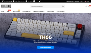
With gratitude to our lovely customers, we are upgrading our website to better fit your browsing habits. Some of the improvements and new features include:
- A smarter search function! Now it works better to help you easily find the products you want.
- Clearer catalog for the website. We’ll be having more groupbuys, new products, cables, moding tools, and other accessories for you this year.
- A Track Your Order function on the top right corner of the webpage.
- Currency transition.
- Better display layout for clean and clear visuality.
However, as you might have noticed, the work has not been fully accomplished yet. There might still be some bugs hidden that we haven’t spotted them yet. You might also find that some contents do not show properly on some pages. Hence, we would like to launch a long-term event:
Find BUGS on epomaker.com!
The rule is simple: find as many bugs on our website as you can, and leave them in the comment. The first discoverer of every bug will receive a piece of voucher valued at $5 on epomaker.com! The more bugs you find, the more vouchers you get! If you have any other new ideas on how to make the website be better for you, feel free to leave your thoughts in the comment too. We are all ears!
This event will last till the end of this year.
From the community, for the community! With the greatest appreciation, we sincerely invite you to join the journey with us.
Cheers,
Epomaker Team







On mobile, when going back from a single product page, the page automatically scrolls to the bottom of the footer and the pagination/load more does not return to last visited point. The user then needs to scroll back up and wait for load more to once again execute.
The fourth column of the ‘Products’ dropdown does not have a header label. It just shows ‘…’.
This comments field seems to be filled with lots of whitespace characters initially.
When clicking on ‘Post comment’ without filling any fields there is no visual feedback or error message.
Mobile bugs
-When clicking on the filter button, and the menu is shown, there is a grey color overlay shown.
-Left padding needed in single product page accordion title section. Description, specs, reviews, etc.
-The fixed bottom bar has 2 round buttons that don’t seem to be aligned correctly to each other. The chat button is lower than the Join epomaker family button.
-When clicking on the left button of the same section(Join epomaker family button), and after closing the popup, the icon in the button shifts to the right.